Showing posts with label concert poster. Show all posts

Thursday, May 8, 2008

The Scenester


My sister is a scenester. A scenester is defined as one whom is always where the action is and whilst there, on the hunt for more. A friend recently sent a picture with a gal wearing a tee with the words, "I listen to bands that don't even exist yet" emblazoned across the front. A most fitting description of my sis.

Recently, our free alternative weekly, The Willamette Week, featured Portland's top ten local bands as voted by members of the music community. My sister, as one of the town's music bookers gave her two cents. As luck would have it the band she chose, The Builders and the Butchers, was voted number one thus her quote selected:

“The first time I saw the Builders and the Butchers was about a year ago at one of those free afternoon back-patio shows at Rontoms. There were these intense storm clouds above us, and we all knew that it would POUR any second. As soon as they started playing, big fat drops came comin’ down—a warm spring rain. Thunder was crashing, lightning flashing off to the east like a high desert storm. The more soaked all of our bodies became, the louder the chorus of wailing voices became—a religious fervor set in. The crowd flailed around, dancing, shouting along to the chorus, ‘When it rains!’ Truly a rock-’n’-roll baptism.”

The musings of a hipster. Tee hee.

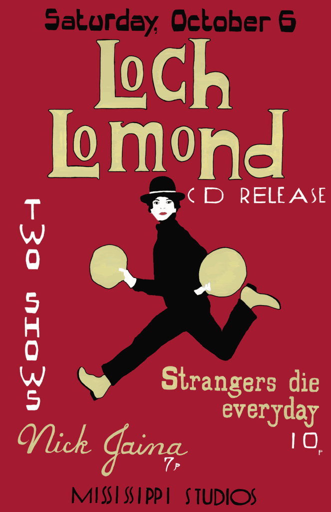
In addition, two other bands were chosen in the top ten, Loch Lomond and Nick Jaina. A few months back I illustrated their CD release promotion concert poster. All the fonts are hand-wrought and the image in a French New Wave style.

Although not a scenester myself, (although I do love to go to the concerts of my favorite bands, I find I usually prefer an evening of Masterpiece Theatre and a pint of ice cream to the bars) I may live vicariously through both my art and my sis.
Stumble Upon Toolbar

Friday, February 22, 2008

The Black Heart Procession and Artistic License


This poster for The Black Heart Procession was illustrated on the floor of my mother-in-law's Berkeley house. Noting the bands rather dark leanings and thus using various funereal ephemera, I based the illustration on a 1920s burial announcement.

This was my first concert poster for a big-name band. Concert posters are perhaps my favorite illustration project as I usually have full artistic license. Artists themselves, band members tend to trust my vision of their music and allow for complete creative autonomy. Developing my own themes, fonts and color schemes provides the spark to develop a piece that is truly unique yet maintains the band's musical energy.

Stumble Upon Toolbar

Monday, February 18, 2008

Art Deco and The Rock Star

Photobucket

When I was seventeen my ten best friends and I (all of whom I am still in close contact with, strangely enough) saw Tori Amos on her Little Earthquakes tour. She was so beautiful. An ethereal red-headed song fairy with a punch not easily missed.

Fifteen years later, Tori is still touring. Now with four other personae to accompany her (I chose the blonde 1920s Art Deco jazz-singer beauty, "Santa" to portray in this concert poster), she has matured--no longer so tortured, no longer as angry.

When asked to execute the illustration for this concert poster at the fancy-pants Arlene Schnitzer Concert Hall in Portland, Oregon, I put an enormous amount of pressure on the design of this poster: my expectations too high, my thoughts too grand. I wanted to recreate the excitement I felt as a seventeen year old girl, to encapsulate my adolescent tragic sense of self, yet make for an eye-catching poster.

I must say, I no longer listen to Tori, except for a few songs (Leather, Silent All These Years, Cornflake Girl) that take me back to another era entirely.

The fonts are hand-wrought and of my own design and the illustration based on Tori herself (but not as herself).

Stumble Upon Toolbar

Sunday, February 10, 2008

Illustration Redux--The Concert Poster & The Moleskine

Certain illustrations I feel a particular affinity for. The Portland based chamber rock group Bright Red Paper asked me to do a series of concert posters last winter. Basing my illustration on an Art Nouveau etching found in an antique design book, I sought to capture the tragic vitality of the mime as a means to describe the orchestral musings of Bright Red Paper. The fonts are, as usual, of my own creation and design.

The "Harlequin" finds himself yet again the subject of a project. Reillustrating him to fit the confines of a Moleskine journal and adding a moon and stars, he now graces the cover of these pocket-sized handmade journals (available in my Etsy shop).

Stumble Upon Toolbar

Friday, February 1, 2008

Sharing the Road--Portland's Bicycle Community


Portland is a town run by the bicycle. Relatively flat terrain, streets that run along a grid as well as a green mentality allow Portland to be the city with the most bicycle commuters.


Last night I watched Foreign Correspondent, a very old Alfred Hitchcock movie featuring Amsterdam. Bicycles dictated traffic and seemed to be the primary mode of transportation along the cobbled Dutch streets.

Bicycles still rule the streets of Amsterdam, but like Portland, they no longer dictate traffic as SUVs now rule the road. And while much of Amsterdam looks as it did through Hitchcock's lens in 1940, the bicycle is not quite as prominent.

Although the city of Portland protects cyclists through legislation, accidents occur. Every year Portland's bicycle community puts on a concert and bike ride to promote bike safety and celebrate the lives of those who were lost to bicycle accidents. The benefit is called "Share the Road."

The benefit is a consortium of local bands. I illustrated this concert poster using as my inspiration a picture I had taken of my sister riding her bicycle through the Dutch countryside. (This was our first international trip together and we had a grand time, despite our ridiculous matching backpacks.)

Each font is hand-wrought and from my own unique alphabets. Along with calligraphy, designing alphabets is my favorite aspect of my profession. A well drawn font can articulate a specific theme, era, and mood whilst drawing proper attention to the message at large. However, the font style must also match the illustration to allow for a well executed event poster.

Stumble Upon Toolbar

Thursday, January 17, 2008

Album Art--My First Foray Part I


I just started a new commission today. It is for an album cover entitled "Knives That Stab Your Face." I know, pretty intense. However, Brian, the soul behind "Knives," is a slight redhead reminiscent of a rookie detective from Scotland Yard. I think it's the goatee. His music is akin to Elliott Smith or Leonard Cohen. Singer-song writer stuff with a dark edge. Hence, "Knives That Stab Your Face." The theme of the album art is to be "sinister" but will not be literal.

This being my first foray into album art, I am very excited about it. Brian wants to have the album ready for printing in a month. So that leaves me like two weeks. Yikes. Better get to work and stop futzing around on the computer....

Oh, and pictured is the painting Brian likes best and I am using as the inspiration for the album cover.

Stumble Upon Toolbar