Thursday, February 28, 2008

1960s Mod Fashion, London and Me


London is perhaps my favorite city in the world (thus far). My deep connection to 19th century literature, my love for Brit Pop and mod fashion as well as pub culture, rain and a bizarre fascination with the monarchy, all make London feel like home.

I always stay at the same hotel near Hyde Park. A bargain at £55.00, it includes a full English breakfast (stewed prunes and all), a very small television, views of bustling Bayswater, but no bathroom.

As London is one of the most expensive cities and the pound worth twice that of the dollar, I spend most of my days walking or in the depths of one of their many incredible, free museums. Again, London serves as the focal point for all that I find interesting, and the British Museum its centerpiece and crowning empirical acheivement. I've been to Troy in Turkey (now a parking lot with a phony Trojan horse), but saw Troy in the British Museum. I have traveled to Egypt but saw a mummy for the first tme in the confines of the British Museum. In addition, the Elgin Marbles, Rosetta Stone and much of the Roman Empire lie in wait at the British Museum.

Colonialism has made its mark in the museum world. At the end of the 19th century the study of archaeology began in earnest as various European empires scrambled for power, seeking to conquer and spread "civilization." Looting their conquests of national treasure (and thus depleting signs of native "civilization"), the British, Germans and Austrians among others filled their coffers nicely with what were essentially stolen goods. To visit Troy and see a parking lot or want to go to Tunisia and see Carthage only to find it exists wholly in Berlin is depressing, to say the least. Thus I lift my spirits and drag my thoughts away from quagmire colonialism has created by utterly enjoying myself with all London has to offer.

Pictured is my tribute to London: my illustration of a 1960s mod fashion plate, beautiful but a bit cold.

Stumble Upon Toolbar

Wednesday, February 27, 2008

A Design Revolution


Last night I had the occasion to attend Design Sponge's Biz Lady Meeting. A workshop held by the wildy popular blog, Design Sponge, as local design success Amy Ruppel as well as a Portland independent woman business owner, a Mercy Corps representative and the founder of Design Sponge herself gave over precious marketing, business planning and PR advice.

As Portland is a hot-bed for indie designers from illustration to fashion to jewelry and everything in between, it was the largest event that the New York-based Design Sponge ever held. There's an design revolution a brewing here, I'm telling you.

For many of us artistic ladies, solitude is the norm. The opportunity to meet others in similar fields and discuss ourselves, our business, our concerns and our future is invaluable.

Thus, I dedicate this painting to Design Sponge. It is entitled Demeter, Goddess of Fertility.

Stumble Upon Toolbar

Tuesday, February 26, 2008

Femme Fatale


One of my favorite movies of all time is His Girl Friday starring Rosalind Russell, in what is perhaps one of the greatest roles of all time, and the exceptionally charming Mr. Cary Grant.

Ms. Russell plays Hildy Johnson, a clever, sassy and beautiful reporter. Cary Grant is Walter Burns, her inescapably enchanting ex-husband. The premise of the movie concerns Hildy who will be happy to live a life where she will be treated like a real woman, not a newsman. Walter seeks to lure her back to the paper and the career-driven life they shared.

A sampling of the lightning-fast, searing dialogue:

Walter Burns: There's been a lamp burning in the window for ya, honey... here.
Hildy Johnson: Oh, I jumped out that window a long time ago.

Pictured is my tribute Hildy Johnson: professional, scorchingly intelligent, beautiful and, of course, well-dressed.

Stumble Upon Toolbar

Monday, February 25, 2008

Calligraphy As Art: Hebrew, Font and The Invitation


The beauty of Hebrew calligraphy is its malleability. One can render letters to create a mood, atmosphere or theme.

Pictured is the cover of a wedding invitation. The graphic is the Hebrew names of the bride and groom interlaced with one another.

The design of a wedding invitation can be quite a process--possibly involving the bride, her mother, the groom, an aunt or sister or two, and, of course, a mother-in-law; quite a force to be reckoned with.

However, so many minds at work produces a work of art in which everyone has played a part. Feeling truly part of the festivities for this most important aspect, the wedding invitation, allows for the family to help the bride and groom begin their life anew.

But sometimes, I am given full artistic license (as in this case) and just go with a feeling I have about the couple; allowing my creativity to simply grow from there.

Stumble Upon Toolbar

Saturday, February 23, 2008

Beauty, Art and Therapy


My friend Dani is an art therapist. When looking at my work she always analyzes me, rather than my art. She pointedly asks, "What were you thinking when you drew this?" Or, "How does this image make you feel." I simply chuckle at her, smile and ignore telling her to stop shrinking my brain.

Her comment on this piece includes the psycho-babble that I love her for: "This is really a significant piece. I love the tension between the green and the diagonal red and wine colors. This piece must have come from deep in your subconscious..."

To be honest, I have no idea where my inspiration is derived from. Most of the time, I find a model--a photograph, magazine clipping or even a poem and start from there; my creativity a force unto itself.

Stumble Upon Toolbar

Friday, February 22, 2008

The Black Heart Procession and Artistic License


This poster for The Black Heart Procession was illustrated on the floor of my mother-in-law's Berkeley house. Noting the bands rather dark leanings and thus using various funereal ephemera, I based the illustration on a 1920s burial announcement.

This was my first concert poster for a big-name band. Concert posters are perhaps my favorite illustration project as I usually have full artistic license. Artists themselves, band members tend to trust my vision of their music and allow for complete creative autonomy. Developing my own themes, fonts and color schemes provides the spark to develop a piece that is truly unique yet maintains the band's musical energy.

Stumble Upon Toolbar

Thursday, February 21, 2008

Sleeping by the Fishes


My father loves fish. One day, when I was little, he decided he wanted a fish pond. Telling my mother of his vision of a backyard oasis replete with two fish ponds brimming with enormous Japanese koi, she quickly dismissed this notion as a passing fancy; another one of his ridiculous, destructive decorating schemes.

He waited until she was at work, borrowed a jack hammer and went to town on our backyard. Twenty years later there are indeed two fish ponds in their backyard (I have long since moved) brimming with small to medium-sized koi, a fountain and two benches; his dream fully realized.

I painted "I Pesci" in honor of my father. A tribute to the fish for a man obsessed.

Stumble Upon Toolbar

Wednesday, February 20, 2008

Hebrew Calligraphy, Watercolor and The Ketubah


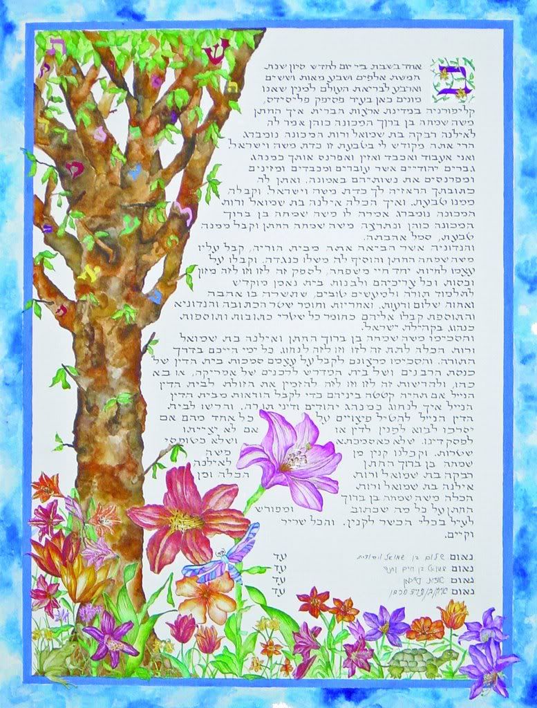
The Ketubah pictured was commissioned by a bride and groom from Los Angeles. The wedding took place in June in Bel Air; just the picture of springtime. Creating a forest of flora and fauna, I sought to capture the beauty of blooming California flowers.

The Ketubah is a Jewish marriage contract dating back 2000 years. Although traditionally written in Aramaic, in Hebrew the word literally means "it is written."

The Ketubah is one of the first legal documents securing financial and legal rights to women.

The calligraphy is executed by my own hand. The font chosen is modern and informal. Hebrew calligraphy is done with the same calligraphy pen as one uses with English. As a left-hander, Hebrew calligraphy suits me well as it is from right to left. When executing English calligraphy, I must constantly take care not smear my work with the side of my hand. When writing Hebrew calligraphy I do not have this problem so my work is actually faster, more fluent.

The illustration, design, calligraphy and watercolor of a Ketubah is quite a large job. Poster size (16" x 20"), each inch is detailed, every centimeter given care. Meant to hang on the wall for life and be kept for generations to come, the Ketubah is a work of art meant to capture a specific time, place and the love of two very unique people.

Stumble Upon Toolbar

Tuesday, February 19, 2008

The Feminine Mystique


My images are primarily based on haute couture fashion portraits from ages past. I would love to have beautiful women posing for me in high fashion, but this is just not the case. Thus I settle for the glamour shots of Edward Steichen and other 1920s and 1930s photographers from which to derive my inspiration.

I sit with a photograph I fancy for hours. Studying the curves of the body, the lines of the dress and the expression of the model ignite a creative spark within. I begin to draw. I may alter her nose, fill in her lips, add a dress bow, change her hairstyle in order give her a bit of a modern sensibility and make her my own. Then I paint. Using gouache, I first see the painting in my mind's eye. I must have a complete visualization before I can paint. I mix the colors using whatever subconscious force brought me there to begin with.

Painting quickly so the gouache dries evenly, the most time-consuming process is the thinking, the visualization. The actualization is rather hurried as I have learned over the years not to over think; to use that inner-drive that forces my creativity.

This painting was executed as part of a series of wine labels for Stella Fino Winery in Walla Walla, Washington.

Stumble Upon Toolbar

Monday, February 18, 2008

Art Deco and The Rock Star

Photobucket

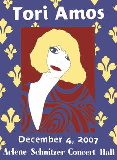
When I was seventeen my ten best friends and I (all of whom I am still in close contact with, strangely enough) saw Tori Amos on her Little Earthquakes tour. She was so beautiful. An ethereal red-headed song fairy with a punch not easily missed.

Fifteen years later, Tori is still touring. Now with four other personae to accompany her (I chose the blonde 1920s Art Deco jazz-singer beauty, "Santa" to portray in this concert poster), she has matured--no longer so tortured, no longer as angry.

When asked to execute the illustration for this concert poster at the fancy-pants Arlene Schnitzer Concert Hall in Portland, Oregon, I put an enormous amount of pressure on the design of this poster: my expectations too high, my thoughts too grand. I wanted to recreate the excitement I felt as a seventeen year old girl, to encapsulate my adolescent tragic sense of self, yet make for an eye-catching poster.

I must say, I no longer listen to Tori, except for a few songs (Leather, Silent All These Years, Cornflake Girl) that take me back to another era entirely.

The fonts are hand-wrought and of my own design and the illustration based on Tori herself (but not as herself).

Stumble Upon Toolbar

Saturday, February 16, 2008

An Ephemeral Identity


A font illustrates a theme, an era, a mood. The collaboration of the art of calligraphy with the beauty of Art Nouveau alphabets make for a modern elegant invitation.

The inspiration for this font was derived from a French perfume bottle circa 1920. Combing Art Deco and Art Nouveau design books, sheet music, magazine advertisements and the boxes upon boxes of ephemera I store haphazardly in my studio allows me to connect with a time, feel a place, transcend my present state.

Stumble Upon Toolbar

Friday, February 15, 2008

Farewell Kabarista


I feel most blessed to live in the independent music capital of Portland, Oregon. Last night I enjoyed the lively Victorian-era French cabaret circus stylings of Vagabond Opera at the old Wonder Ballroom.

The fair red-headed chanteuse's rendition of Edith Piaf's swooning melody, Milord, the hulahooping fire-eating chorus girl and a general atmosphere of hedonistic bohemian revelry made for a most memorable Valentine's Day.


Pictured is my bohemian muse. If I close my eyes I can see her dancing to the music.

Stumble Upon Toolbar

Thursday, February 14, 2008

A Most Beautiful Life (La Belle Vie.....)


Springtime is almost here. I can feel it.

Today celebrates love, friendship and consumption. All in all, life is pretty good.

Receiving two blog features this week stroked the ego and reinstated hope. During these long winter months in the Great Northwest, one can begin to feel a bit isolated, a bit insular in her existence especially if one is in her studio all day with her mastiff Belle as her primary conversation partner.

The features I received this week spoke of my Art Deco style, wares available as well as custom commissions including Art Deco and Art Nouveau style invitations and calligraphy. The blogs are both lovely and well-written including beautiful designers from the world over. Indie Quarter, based out of Manchester, UK and Vintage Indie in the U.S., feature and help promote independent artists.

In fact, Indie Quarter bought one of my hand-painted Parisian Girl Moleskine journals for herself from my Etsy shop.

Both Indie Quarter and Vintage Indie chose this illustration to feature. La Belle Vie has proven a most popular design and I have screenprinted it on to totes, aprons and signed limited-edition numbered prints all for purchase in my Etsy shop.

Stumble Upon Toolbar

Tuesday, February 12, 2008

Calligraphy & The Wedding


Calligraphy finds its place most comfortably in the context of the wedding. The graceful lines, organic forms and classic flourishes exude formality and elegance.

I have had the occasion to calligraph numerous wedding invitations. I create my own alphabets based on examples from Art Nouveau and Art Deco scripts.

As a left-hander, I have a very specific nib that I must use. Unlike the majority of calligraphy nibs, a left-hand nib is oblique.

I am fiercely loyal to the brand of my first calligraphy set gifted to me at age 11. However, about a decade ago, this small British company was sold and the pens are now made in China and of lesser quality.

I still have the original British calligraphy pen and have since bought a spare as well, but locating left-hand nibs for a now extinct calligraphy pen proves quite a difficult task indeed.

Stumble Upon Toolbar

Sunday, February 10, 2008

Illustration Redux--The Concert Poster & The Moleskine

Certain illustrations I feel a particular affinity for. The Portland based chamber rock group Bright Red Paper asked me to do a series of concert posters last winter. Basing my illustration on an Art Nouveau etching found in an antique design book, I sought to capture the tragic vitality of the mime as a means to describe the orchestral musings of Bright Red Paper. The fonts are, as usual, of my own creation and design.

The "Harlequin" finds himself yet again the subject of a project. Reillustrating him to fit the confines of a Moleskine journal and adding a moon and stars, he now graces the cover of these pocket-sized handmade journals (available in my Etsy shop).

Stumble Upon Toolbar

Friday, February 8, 2008

Watercolor, Art Deco & the Travel Poster

It has been ages since I have executed a watercolor painting. Nowadays, I almost exclusively use gouache as it produces an even matte tone suitable for screenprinting.

However, if a commissioned piece is to be color-copied from a high-quality scan, watercolor makes a wonderful showing.

The poster pictured draws its origins from a decidedly Art Deco aesthetic. I designed the alphabet used for the font myself based on various Art Deco alphabets. Inspiration from 1920s French travel posters provided beach scenes and coastal play portraying leisure summer afternoons perfectly coinciding with the notion of a summer camp located directly on the beautiful Pacific Ocean.

Stumble Upon Toolbar

Thursday, February 7, 2008

Walt Whitman & Portland


Whilst strolling about southeast Portland in the seemingly perpetual February drizzle, I spied what is perhaps one of my greatest sources of neighborhood inspiration: a hand-painted sign situated along a streetpole on a fairly major thoroughfare in the beautiful "Rose City" inconspicuously boasting the words of the first great American populist poet, Walt Whitman. His Leaves of Grass is perhaps the greatest collection of poetry of the nineteenth century and "Song of Myself" my most favorite of all.

Everyday I walk my dog Belle, a Mastiff-Lab cross, by the Walt Whitman streetpole (I find this wonderfully apropos as Whitman was a true man of the street, a poet of the senses). Regardless of my present mood, a rather hedonistic creative spirit wells up. My regard for Portland increases despite the present gloominess and my faith in art, culture, society and civilization is happily restored. The power of poetry is quite mighty indeed.

The painting pictured was inspired by my vision of a loud, dark and dirty Victorian era tavern in Whitman's industrial haven of New York City.

Stumble Upon Toolbar

Wednesday, February 6, 2008

Elegance in the Kitchen


I hate cooking. But I love cooking accessories. I collect Le Creuset not because it is top of the line cookware, but rather its beautiful colors and 1920s design. Same with a Kitchenaid. I wouldn't even know how to turn the thing on nor do I care to really learn, but I'm saving up for the mixer in tangerine, because I love anything tangerine.

Over the summer I picked up a seafoam green Sunbeam hand-mixer from a garage sale. It works fantastic, but I simply enjoy its chrome and steel classic Cadillac retro aesthetic.

This passion for vintage kitchen accessories afforded me the notion to screenprint my Art Deco style original images onto cotton kitchen aprons. Sold at craft fairs throughout the Pacific Northwest, aprons by Octavine Illustration have proven a great seller. Although these aprons are highly practical, wearable and washable, I have had more than a few customers who buy the Art Deco style aprons simply to hang in their kitchens. Not to cook with, but rather as a display. These are customers after my own heart.

The cotton kitchen apron pictured is hand screen-printed using my original Art Deco image "Les Filles Veulent Juste Avoir l'Amusement" (Girls Just Want to Have Fun) and is available through my Etsy shop.

Stumble Upon Toolbar

Tuesday, February 5, 2008

A Font Renewer and Creator


I like to think of myself as a font renewer and creator. Cursive, print, italic, gothic, copperplate script ignite a little fire inside. A font tells a story--portraying a mood, feeling and era. To create a symbol that expresses a thought, an idea, an emotion is empowering as each letter serves to create what is in essence, history.

Pictured is an example of a Bat Mitzvah invitation I executed the calligraphy and font design for. The Art Nouveau style font is my very own creation.

Stumble Upon Toolbar

Sunday, February 3, 2008

The Underdog (C'est la vie...)


Last summer I was approached to illustrate a logo for the storefront of a new boutique in Franklin Lakes, New Jersey specializing in luxury imports from France and Italy. Choosing from three very different mock-ups (Each mock-up I do is a full-scale painting in itself--I hate wasting time on something that cannot stand up on its own.) a final was chosen.

However, I personally liked one of the losers. Leave it to me to vote for the underdog.

So here's the one that did not make it (too much detail rendered it doomed from the get go).

The fate of "The Beautiful Life" was not to be seen by hundreds (perhaps thousands?) of high end shoppers but rather to be screenprinted onto totes and kitchen aprons; had by the individual rather than the masses.

Stumble Upon Toolbar

Saturday, February 2, 2008

Vanity, Oh Vanity--Southeast 34th & Belmont


I tell my friends from Manhattan that they have not seen hip until they have spent 20 minutes on the corner of SE Belmont and 34th in Portland, Oregon. Recently featured in the New York Times, this corner boasts the world famous Stumptown Coffee, the ultra-chic Aalto Lounge, a state of the art bicycle parking lot and skinny jeans galore.

Next Saturday, February 9, I will be participating in the Granny Panties Craft Bazaar hosted by the fashionable Aalto Lounge. The Aalto and Stumptown share a front entrance and despite an essentially perpetual drizzle, foot traffic is a constant as hipsters struggle to see and be seen.

In fact, rock star sightings are frequent and it is not unheard of to walk into Stumptown (Using vintage machines to grind their coffee beans Stumptown also got the attention of the New York Times.) and hear The Shins playing whilst stirring your coffee next to James Mercer.

This is my first Portland craft fair of 2008. After a fruitful holiday season, I am excited to get back into the swing of things vending my various Art Deco inspired wares.

The tee pictured is one of my best sellers right now and is on my Etsy store and at the Granny Panties Bazaar in PDX February 9.

Stumble Upon Toolbar

Friday, February 1, 2008

Sharing the Road--Portland's Bicycle Community


Portland is a town run by the bicycle. Relatively flat terrain, streets that run along a grid as well as a green mentality allow Portland to be the city with the most bicycle commuters.


Last night I watched Foreign Correspondent, a very old Alfred Hitchcock movie featuring Amsterdam. Bicycles dictated traffic and seemed to be the primary mode of transportation along the cobbled Dutch streets.

Bicycles still rule the streets of Amsterdam, but like Portland, they no longer dictate traffic as SUVs now rule the road. And while much of Amsterdam looks as it did through Hitchcock's lens in 1940, the bicycle is not quite as prominent.

Although the city of Portland protects cyclists through legislation, accidents occur. Every year Portland's bicycle community puts on a concert and bike ride to promote bike safety and celebrate the lives of those who were lost to bicycle accidents. The benefit is called "Share the Road."

The benefit is a consortium of local bands. I illustrated this concert poster using as my inspiration a picture I had taken of my sister riding her bicycle through the Dutch countryside. (This was our first international trip together and we had a grand time, despite our ridiculous matching backpacks.)

Each font is hand-wrought and from my own unique alphabets. Along with calligraphy, designing alphabets is my favorite aspect of my profession. A well drawn font can articulate a specific theme, era, and mood whilst drawing proper attention to the message at large. However, the font style must also match the illustration to allow for a well executed event poster.

Stumble Upon Toolbar